Using CSS and SVG to mix and cut out images
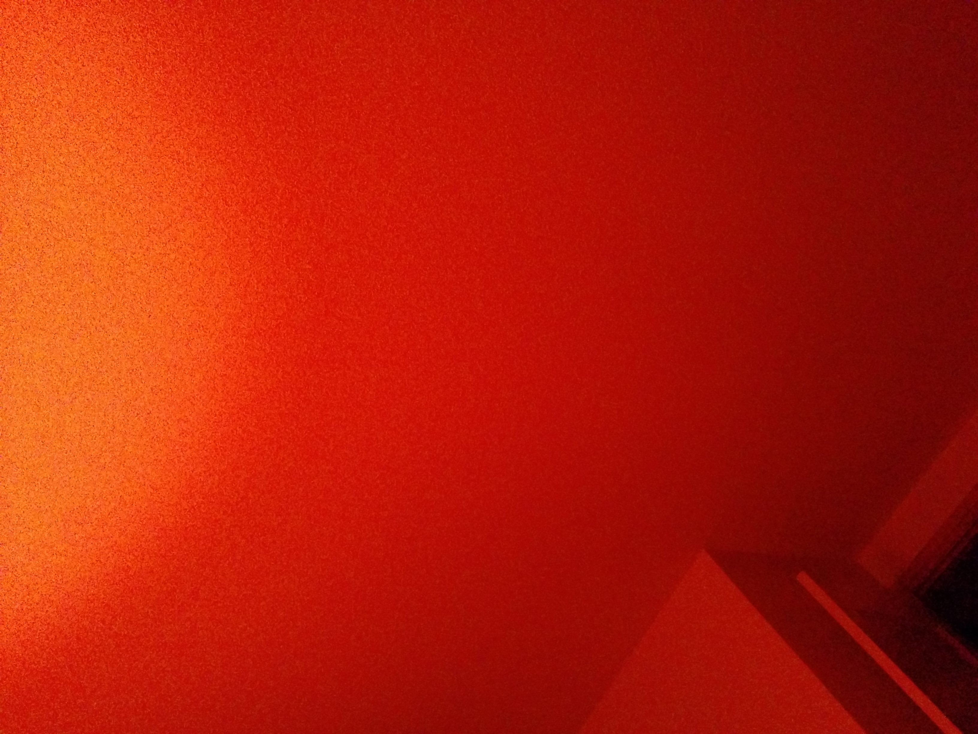
Here we have an image with an SVG mask applied to it.
The SVG file contains quarter circles on each corner, and one full circle in the middle.
It is used to mask, or cut away, parts of the image.
The SVG file looks like this:
The image tag only needs the following CSS rule:
We can also create the opposite effect:
    <?xml version="1.0" encoding="utf-8" ?>
    <svg baseProfile="full" height="100px" version="1.1" width="100px" xmlns="http://www.w3.org/2000/svg" xmlns:ev="http://www.w3.org/2001/xml-events" xmlns:xlink="http://www.w3.org/1999/xlink">
        <defs />
        <circle cx="0" cy="0" r="25"/>
        <circle cx="100" cy="0" r="25"/>
        <circle cx="100" cy="100" r="25"/>
        <circle cx="0" cy="100" r="25"/>
        <circle cx="50" cy="50" r="25"/>
    </svg>
    mask: url(example.svg);
    -webkit-mask: url(example.svg);
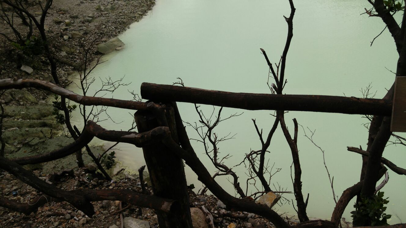
This uses an svg-file as mask, that itself also has a mask applied:
The black circles have been used as a mask on the white background.
The result is a white field with circles cut out.
The remaining white field has been used as a mask for the background image.
If we want to make this in to a fixed background, the CSS for the image looks like this:
We can also stack two images:
    <?xml version="1.0" encoding="utf-8" ?>
    <svg baseProfile="full" height="100px" version="1.1" width="100px" xmlns="http://www.w3.org/2000/svg" xmlns:ev="http://www.w3.org/2001/xml-events" xmlns:xlink="http://www.w3.org/1999/xlink">
        <defs>
            <mask id="mask">
                <rect fill="white" height="100px" width="100px" x="0" y="0" />
                <circle fill="black" cx="50" cy="50" r="25"/>
                <circle fill="black" cx="0" cy="0" r="25"/>
                <circle fill="black" cx="100" cy="0" r="25"/>
                <circle fill="black" cx="100" cy="100" r="25"/>
                <circle fill="black" cx="0" cy="100" r="25"/>
                <circle fill="black" cx="50" cy="50" r="25"/>
            </mask>
        </defs>
        <rect fill="white" mask="url(#mask)" height="100px" width="100px" x="0" y="0" />
    </svg>
    position: fixed;
    bottom: 0px;
    left: 0px;
    width: 100%;
    height: 100%;
    overflow: hidden;
    z-index: -1;
    mask: url(example.svg);
    -webkit-mask: url(example.svg);
This is two images on top of each other, and the top image has a mask.
If we want to stack them like that inline we need to place both images in a div.
The CSS looks like this:
If we want to use them as a fixed background, the CSS looks like this:
    <div>
        <img src="bg1.jpg" class="bg"/>
        <img src="bg2.jpg" class="masked-bg"/>
    </div>
    .bg {
        width: 400px;
        height: 400px;
        overflow: hidden;
        z-index: 2;
        position: relative;
        left: 0px;
    }
    .masked-bg {
        width: 400px;
        height: 400px;
        overflow: hidden;
        z-index: 3;
        position: relative;
        left: -400px;
        mask: url(example.svg);
        -webkit-mask: url(example.svg);
    }
    .bg {
        position: fixed;
        bottom: 0px;
        left: 0px;
        width: 100%;
        height: 100%;
        overflow: hidden;
        z-index: -2;
    }
    .masked-bg {
        position: fixed;
        bottom: 0px;
        left: 0px;
        width: 100%;
        height: 100%;
        overflow: hidden;
        z-index: -1;
        mask: url(example.svg);
        -webkit-mask: url(example.svg);
    }